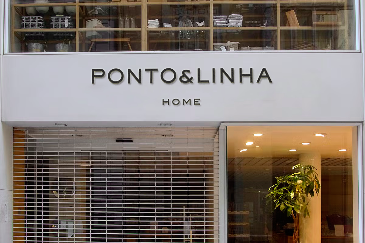
PONTO&LINHA HOME
2025
Desde 1975 atuando no ramo varejista, a Ponto & Linha é uma das lojas mais tradicionais do interior do estado do Rio de Janeiro, por sua história no município que se iniciou no ramo de armarinho e tecidos. Com o processo de sucessão familiar ocorrido há 15 anos, foram agregados novos produtos para atender a um novo segmento: a chegada dos itens de cama, mesa, banho e décor tornaram a empresa uma referência de produtos específicos para o lar.
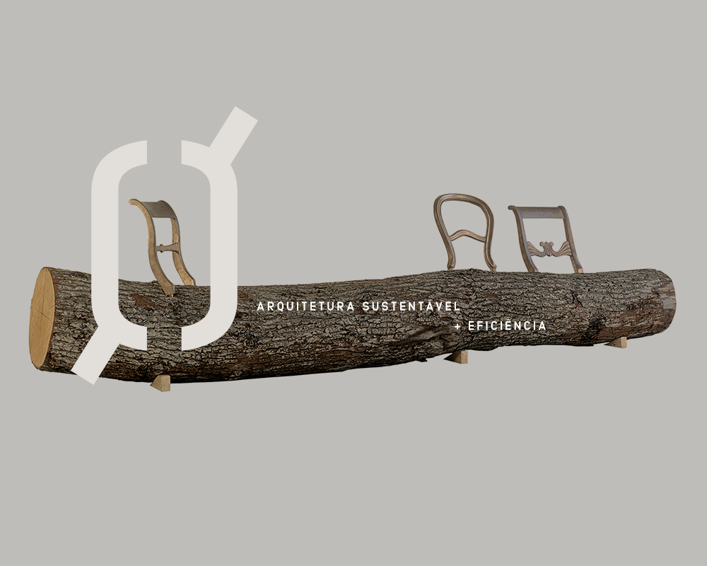
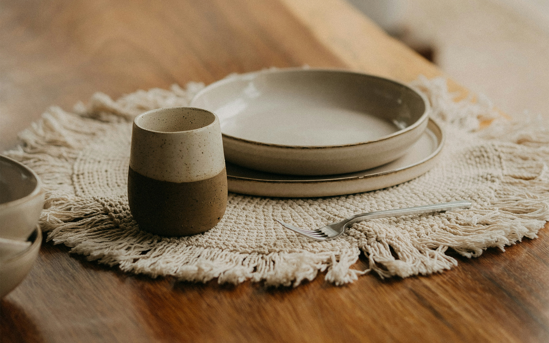
Completando seu cinquentenário em 2025, a necessidade de reestabelecer o seu posicionamento (com a finalidade de atender um novo perfil de público) se fez fundamental para sua transição, visto que ela nunca havia explorado este potencial de abrangência investindo em uma comunicação mais seletiva. Assim, surge a Ponto & Linha Home: uma extensão de alto padrão de sua antiga marca, idealizada para oferecer produtos especializados para casa (utilidades domésticas e decoração) com valor agregado.
EN
Operating in the retail sector since 1975, Ponto & Linha is one of the most traditional stores in the interior of the state of Rio de Janeiro, thanks to its history in the municipality, which began in the haberdashery and fabrics business. With the family succession process 15 years ago, new products were added to serve a new segment: the arrival of bed, table, bath, and décor items made the company a reference for specific home products.
Reaching its fiftieth anniversary in 2025, the need to reestablish its positioning (to serve a new target audience) was crucial to its transition, as it had never before explored this potential reach by investing in more selective communication. Thus, Ponto & Linha Home was born: a high-end extension of its former brand, designed to offer specialized home products (housewares and décor) with added value.

O propósito principal deste projeto esteve em construir uma identidade que validasse este novo momento, rompendo totalmente com a imagem amadora e popular que a antiga marca carregava e a deixava estagnada, por não ter uma comunicação alinhada com o público almejado.
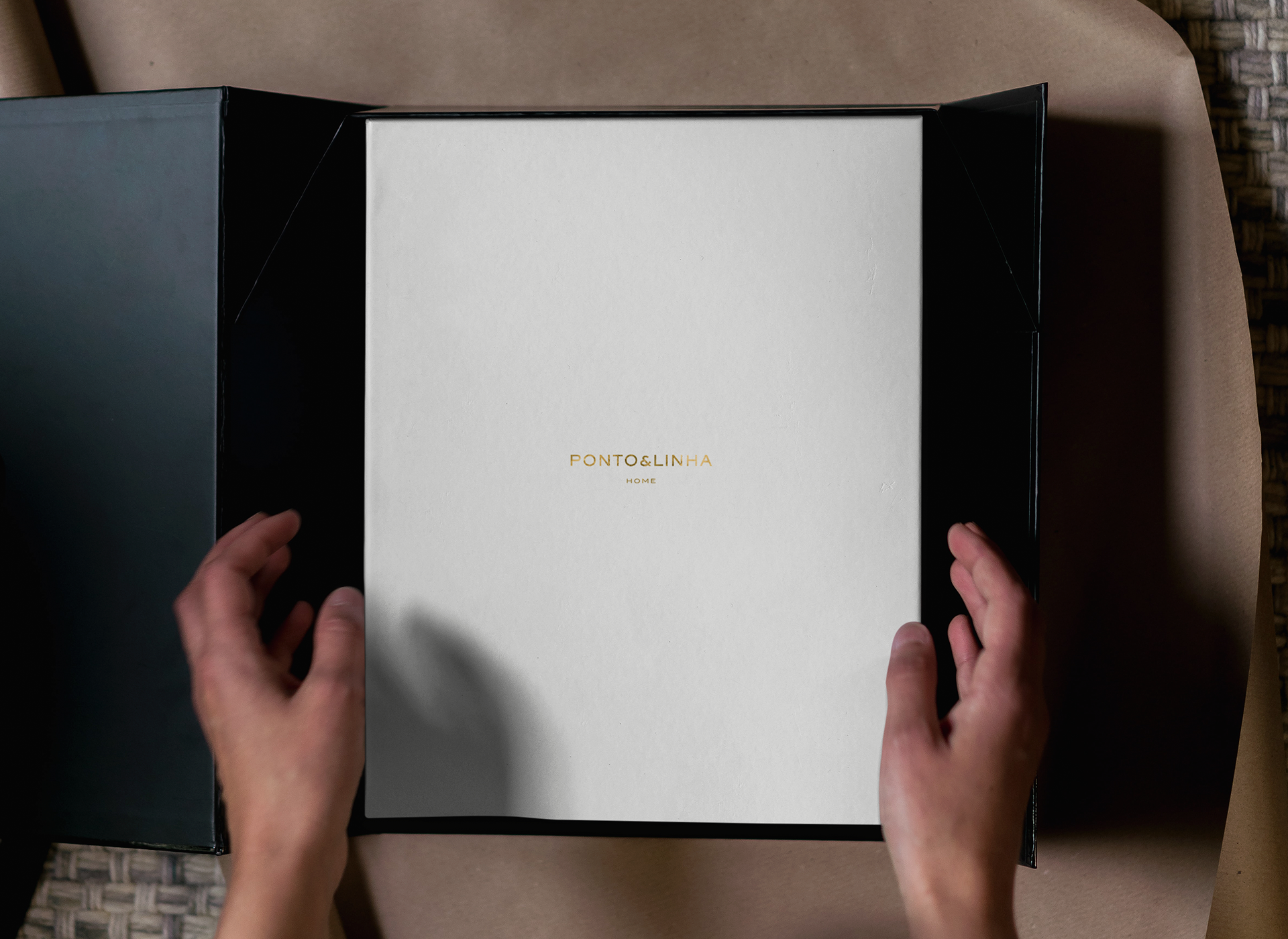
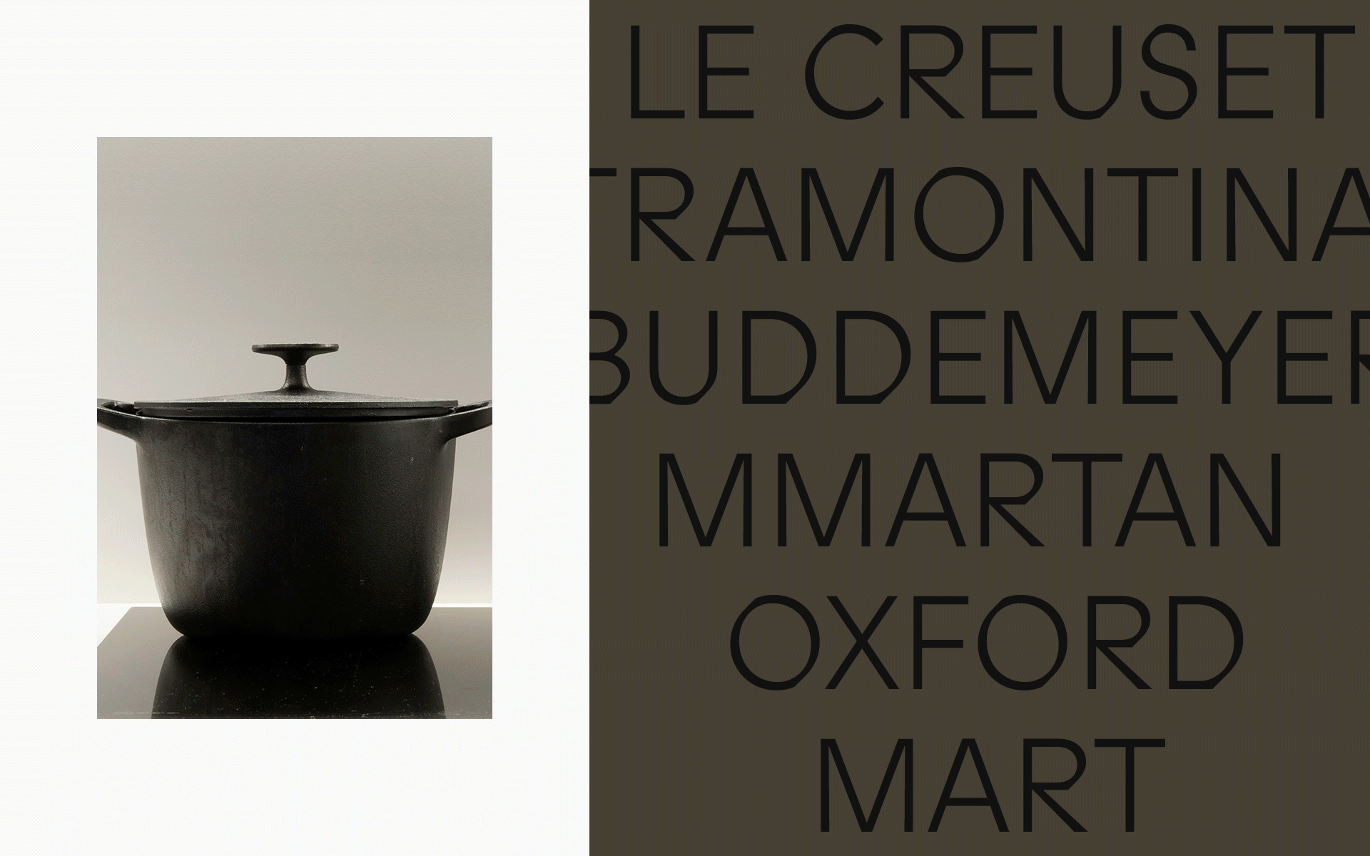
Este ponto foi solucionado com um estudo criterioso, onde redefinir todos os seus atributos estéticos (a começar pelo redesign de assinatura visual + sistema de apoio) e analisar como os seus concorrentes se apresentam, seria o ponto de partida para esta grande mudança. Uma marca que entrega refino, presença e atemporalidade, com um toque clássico na medida certa e pertinente com quem ela se propõe a dialogar a partir de agora.
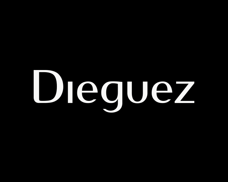
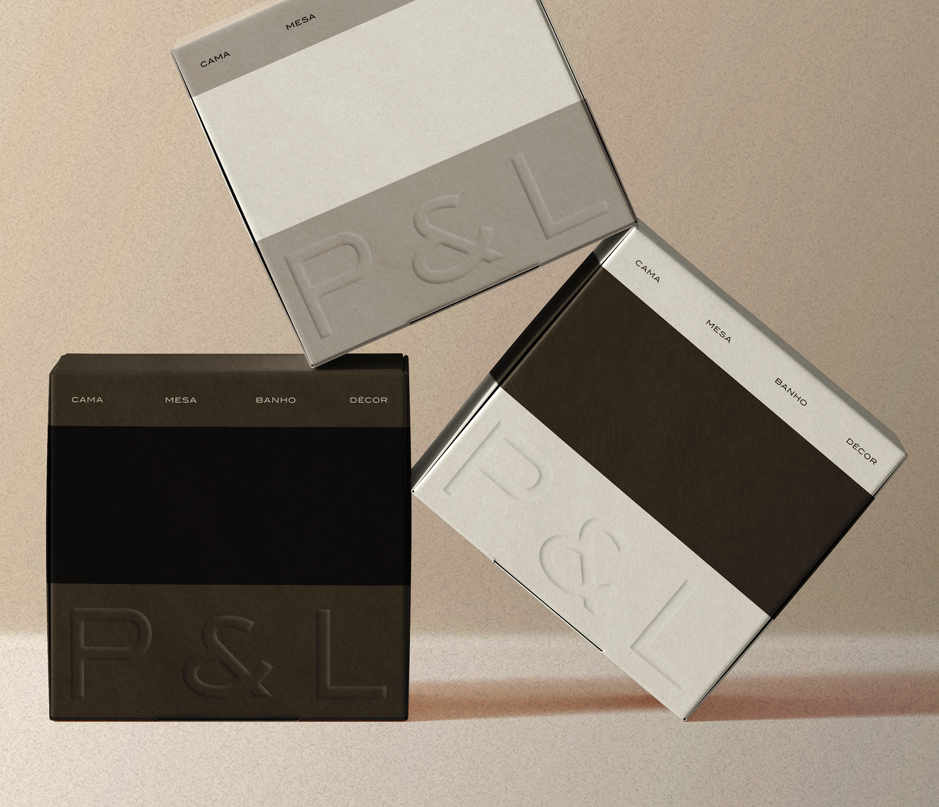
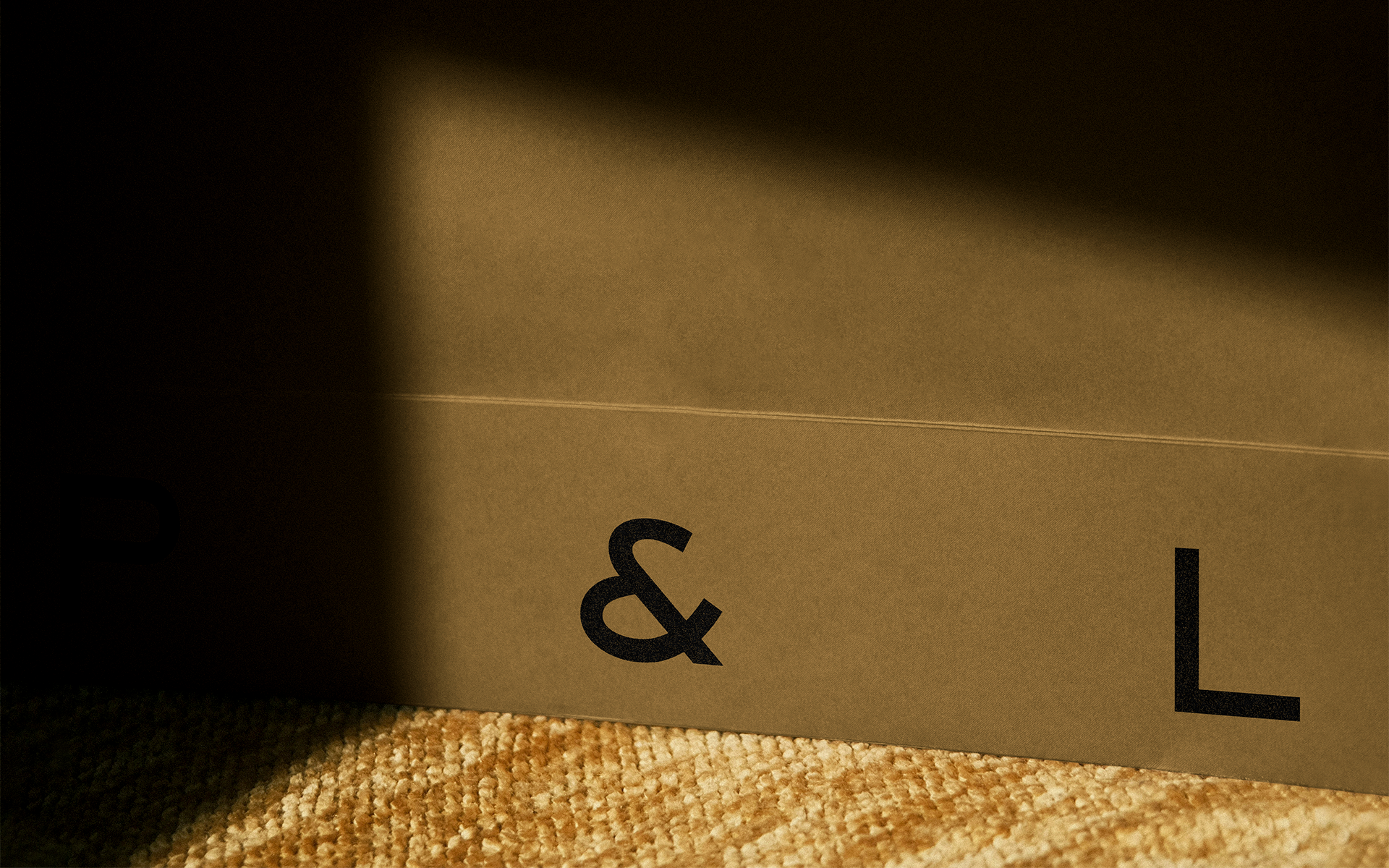
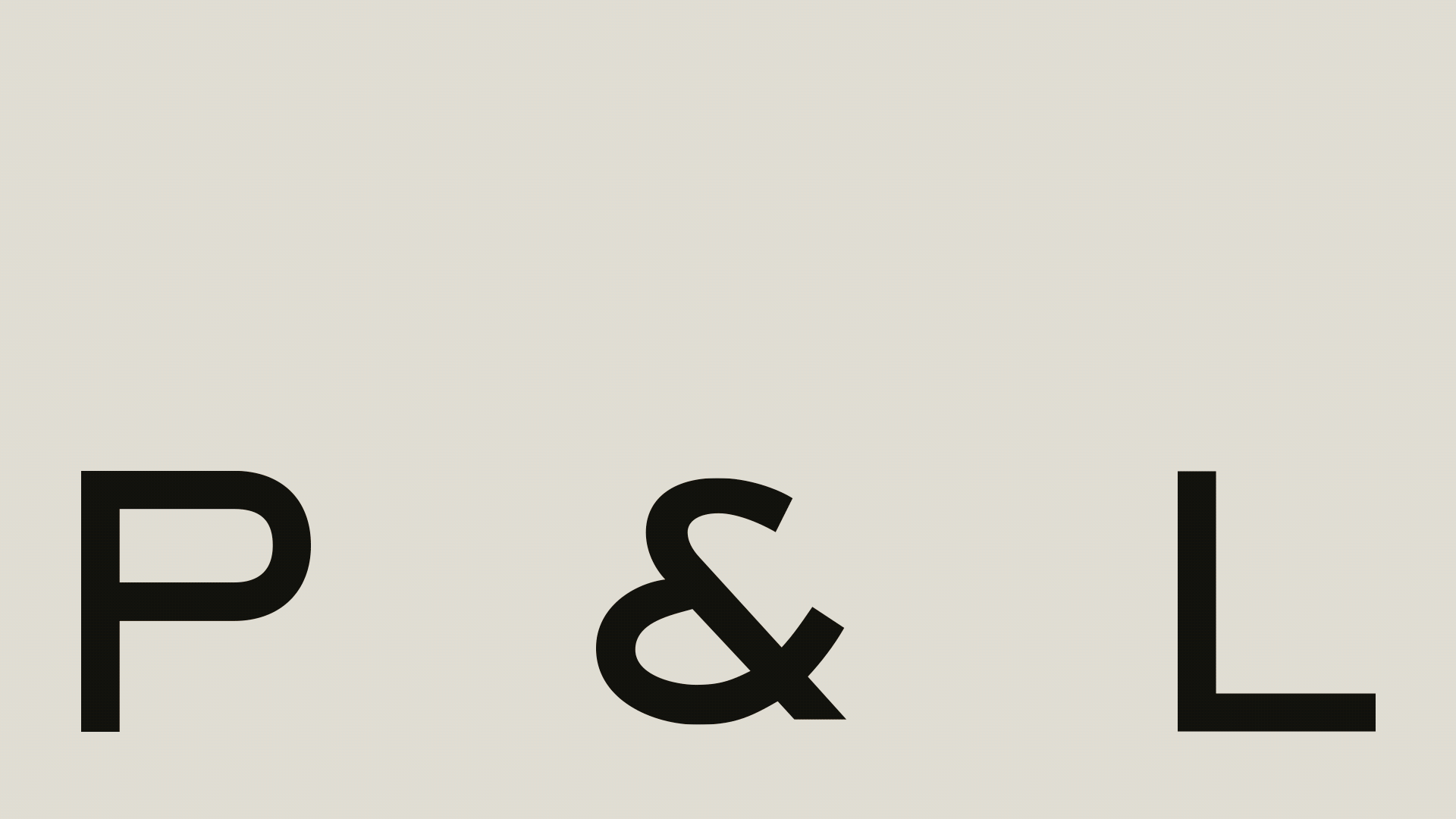
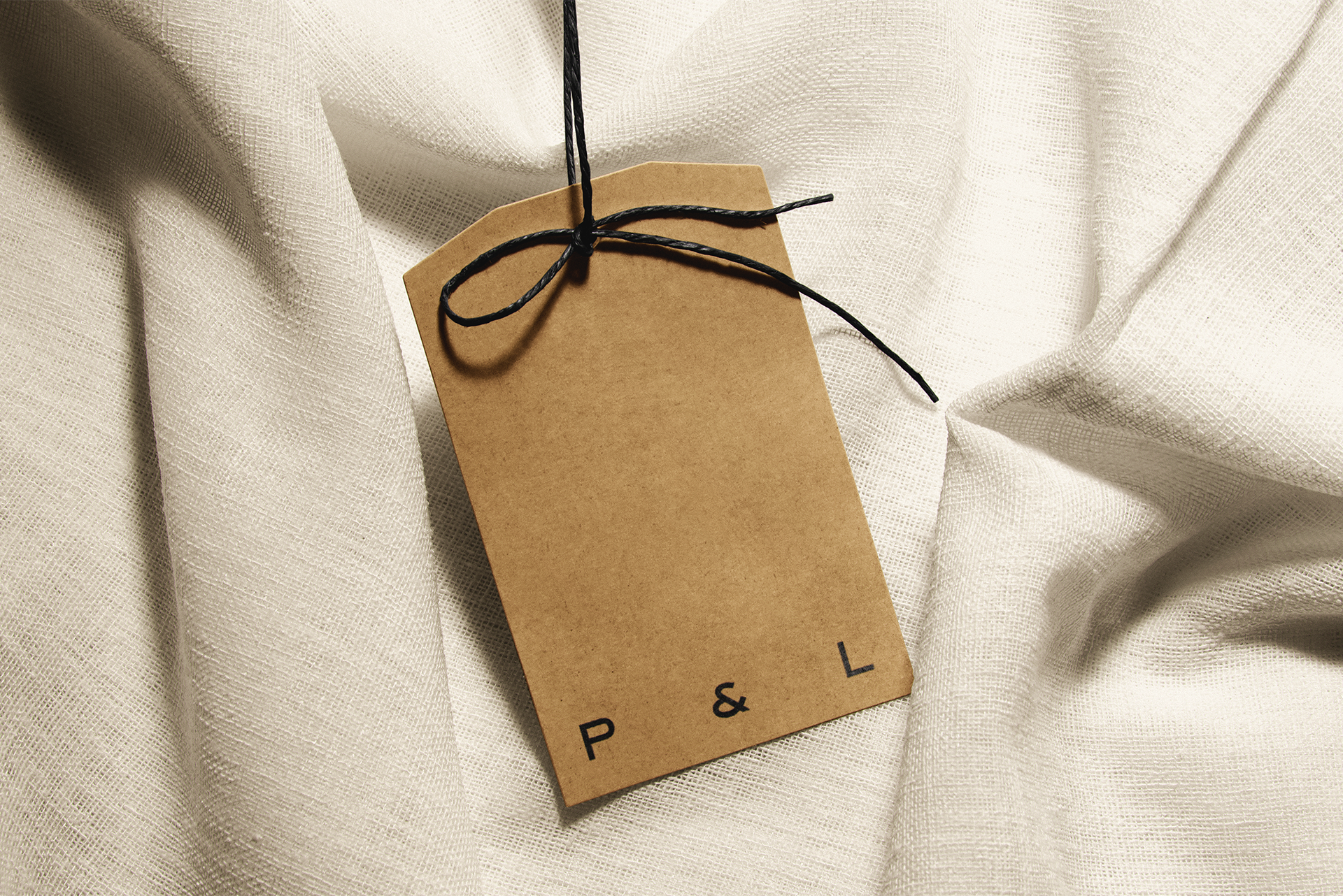
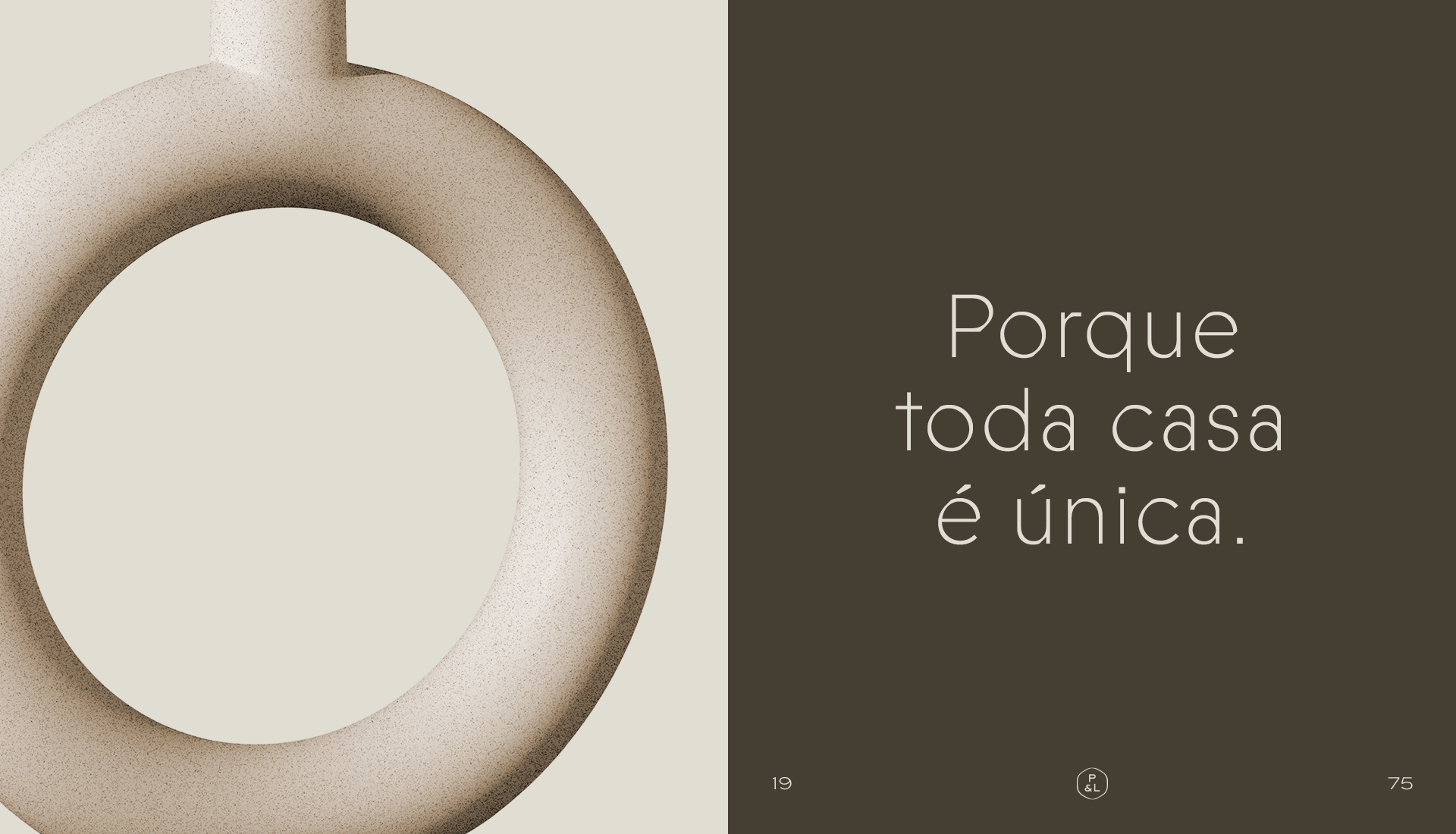
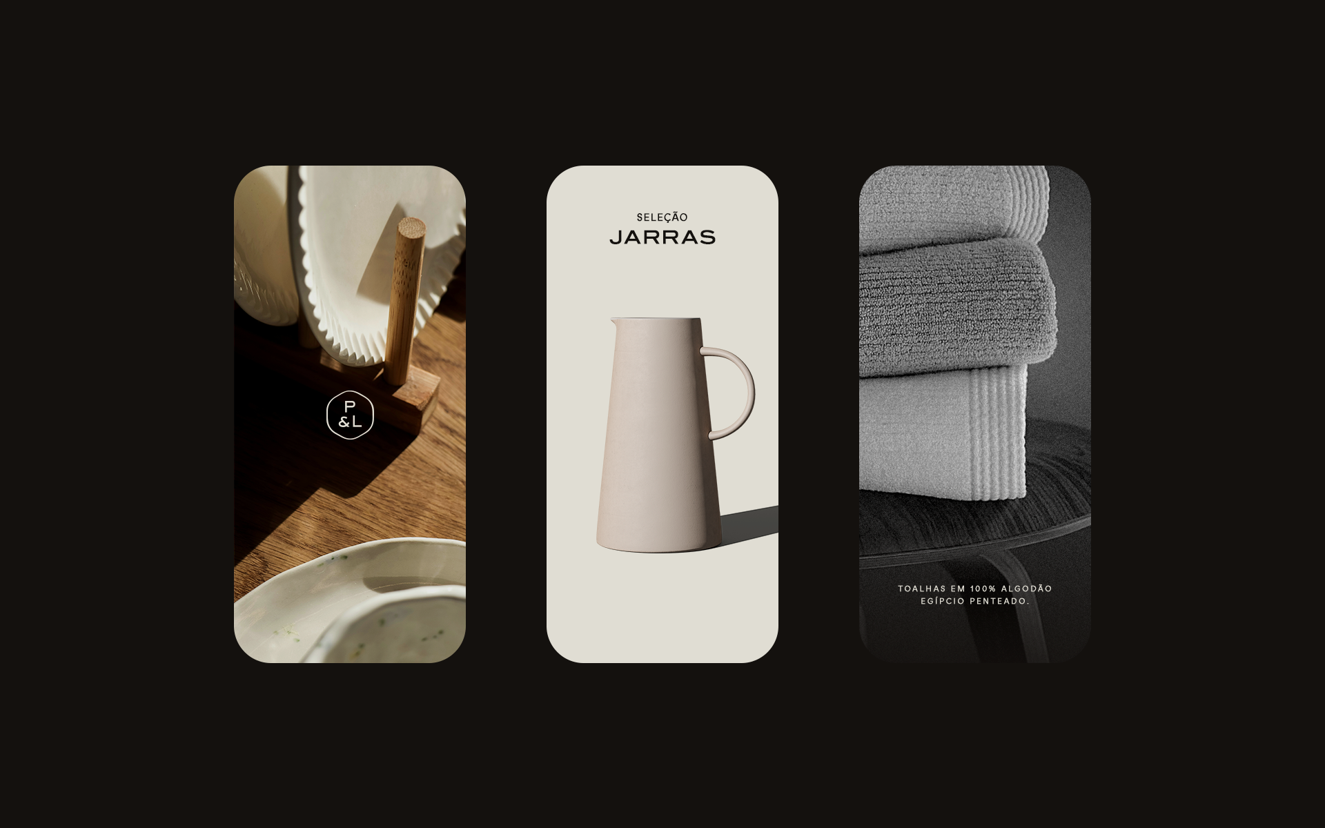
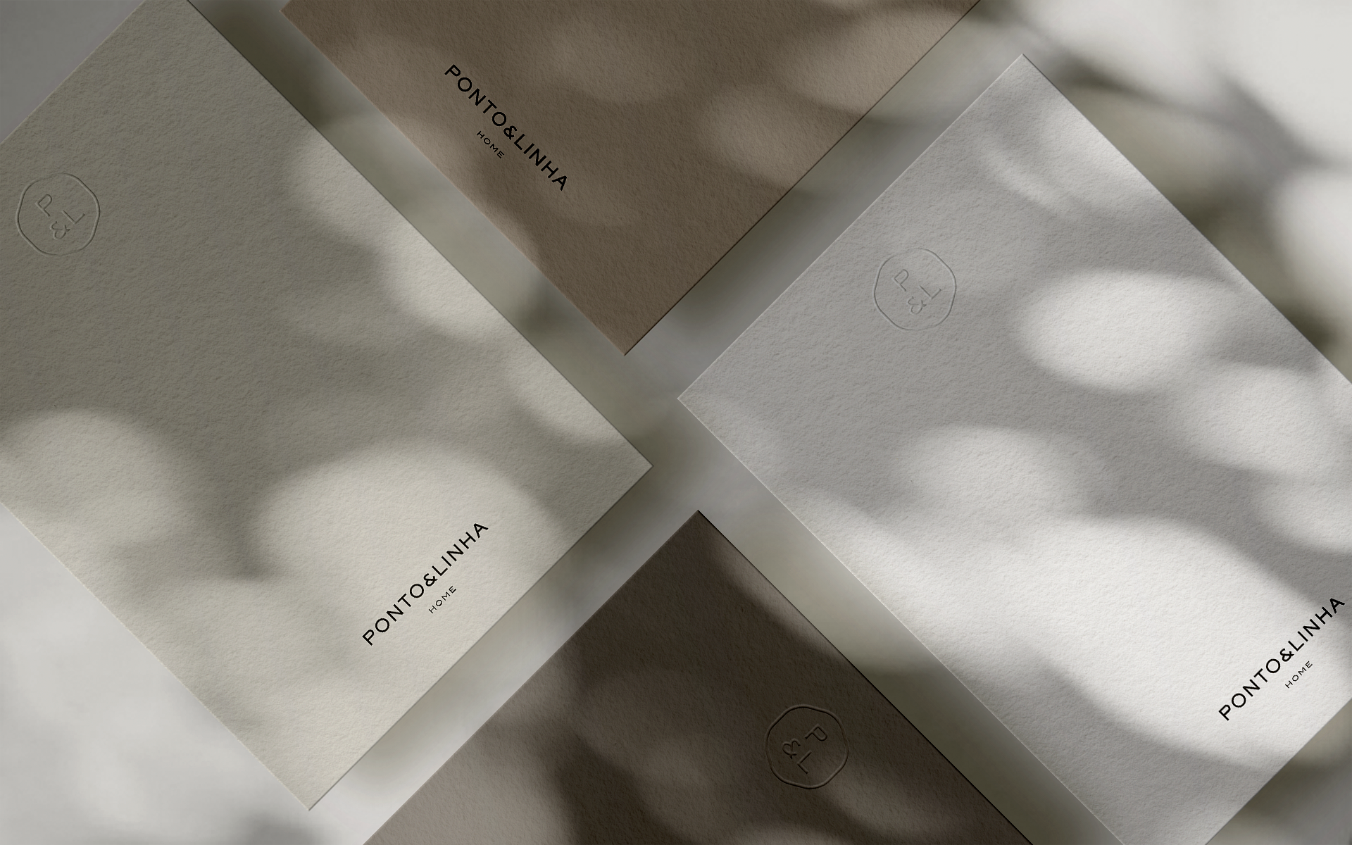
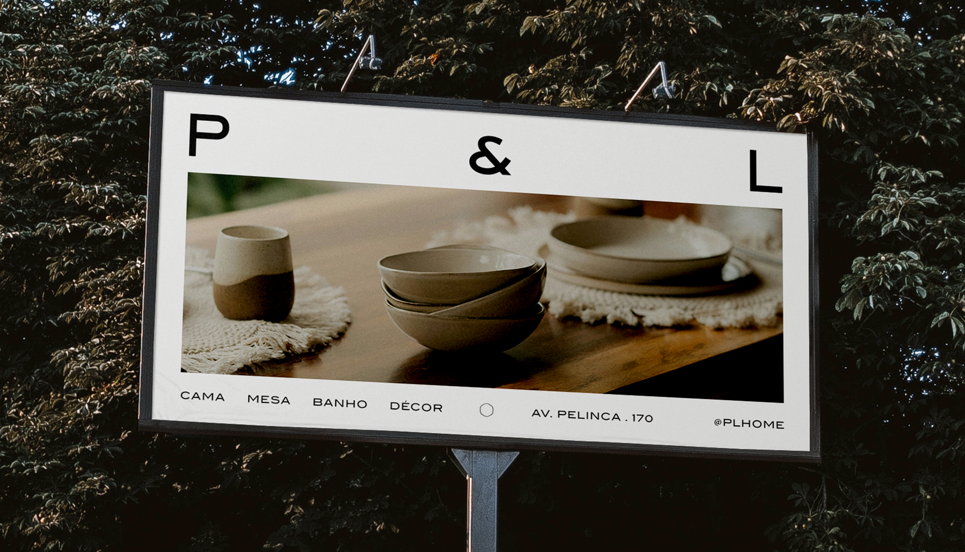
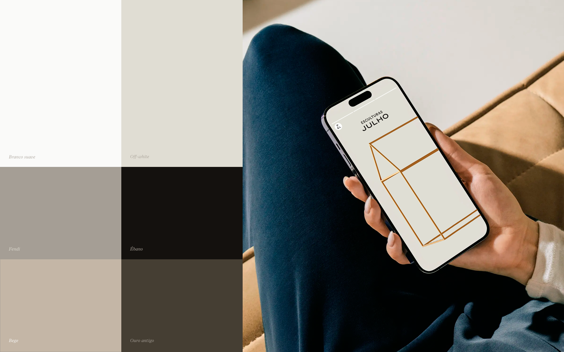
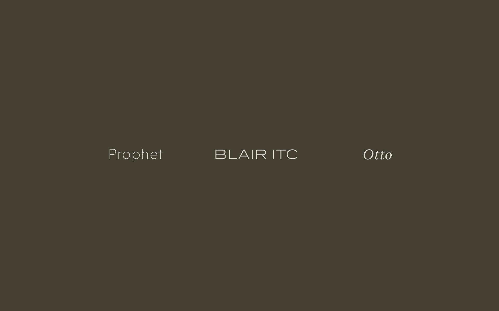
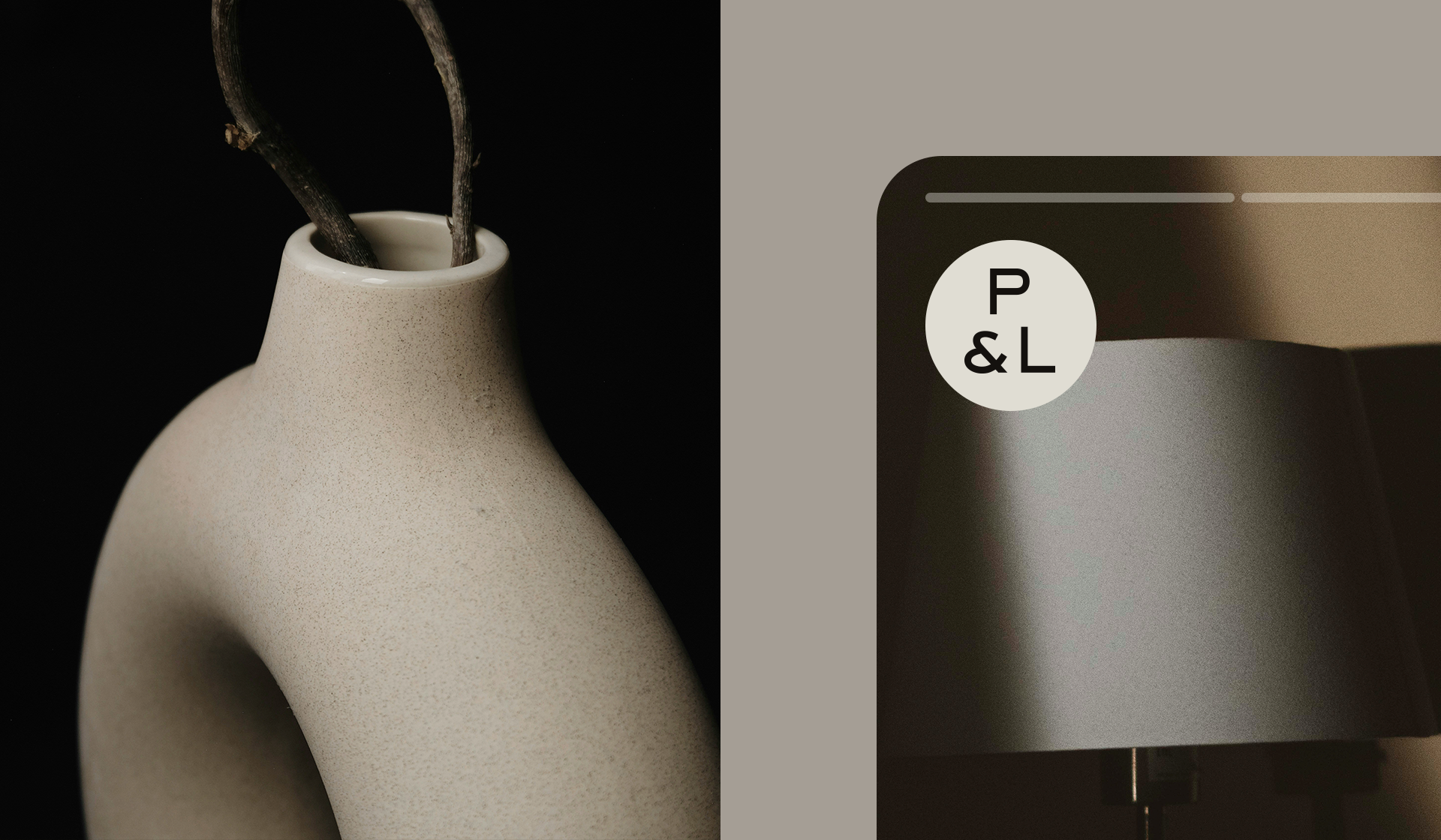
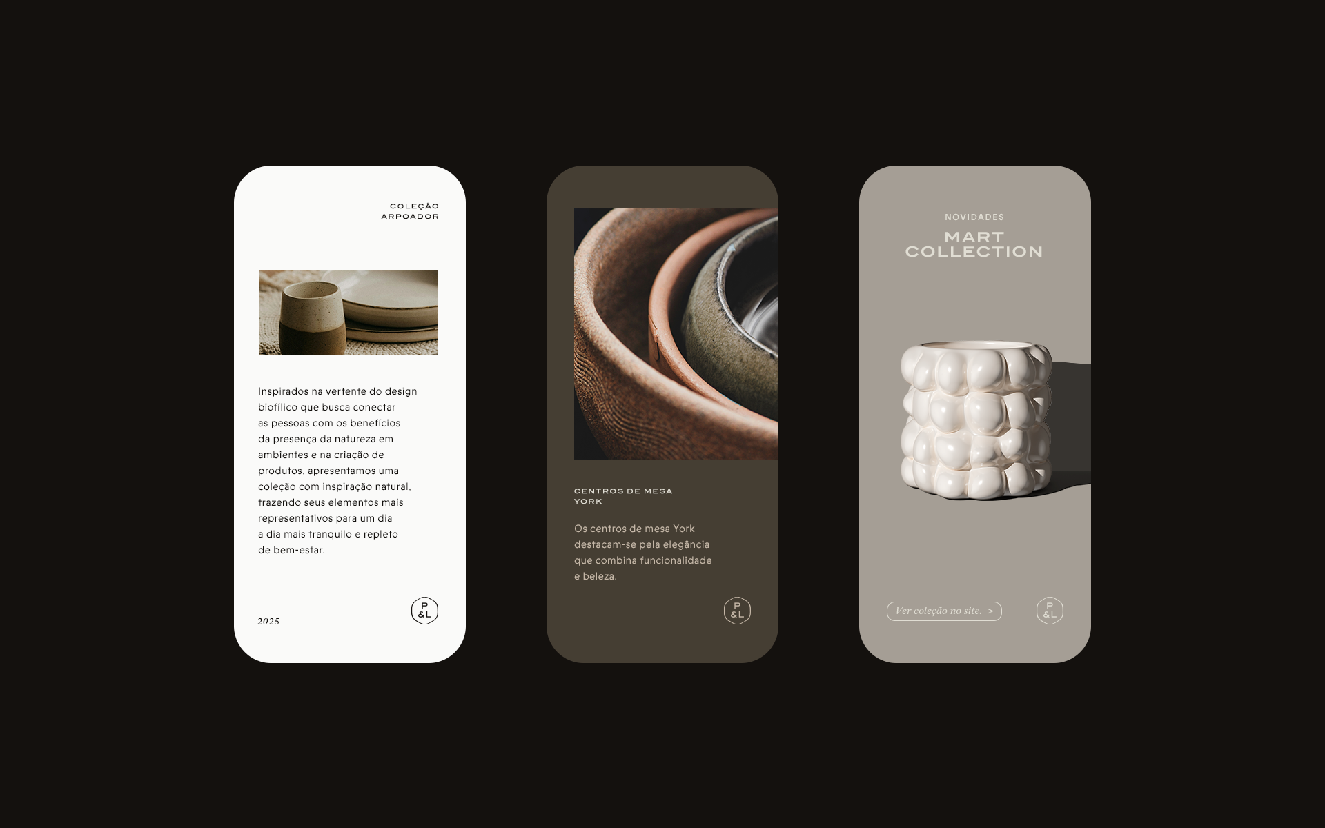
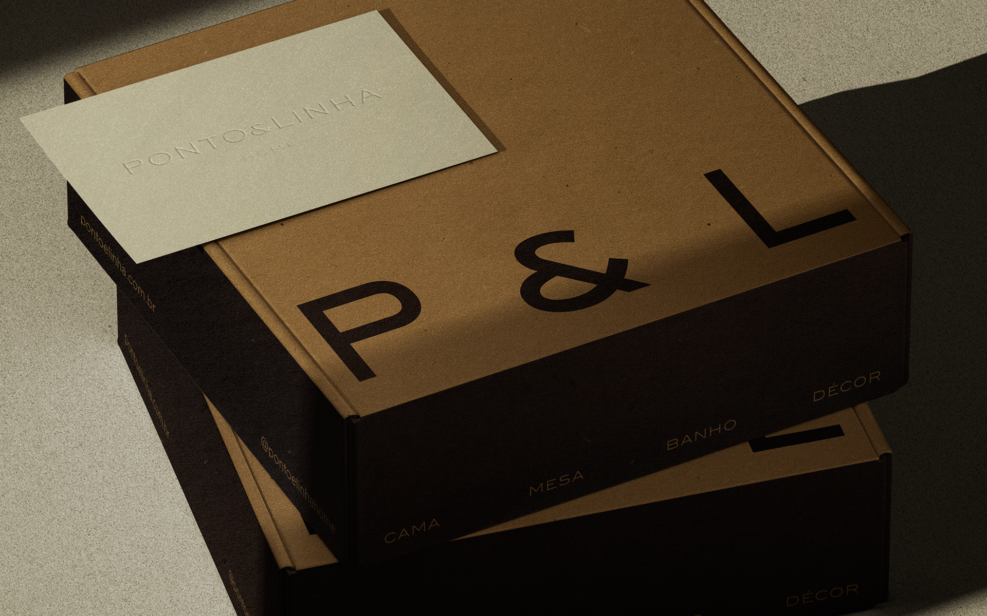
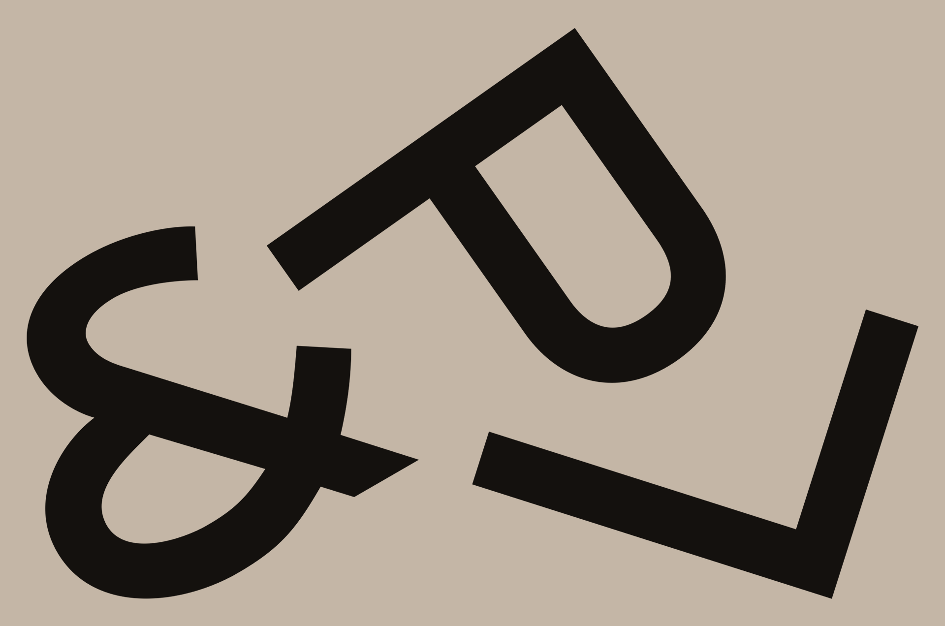
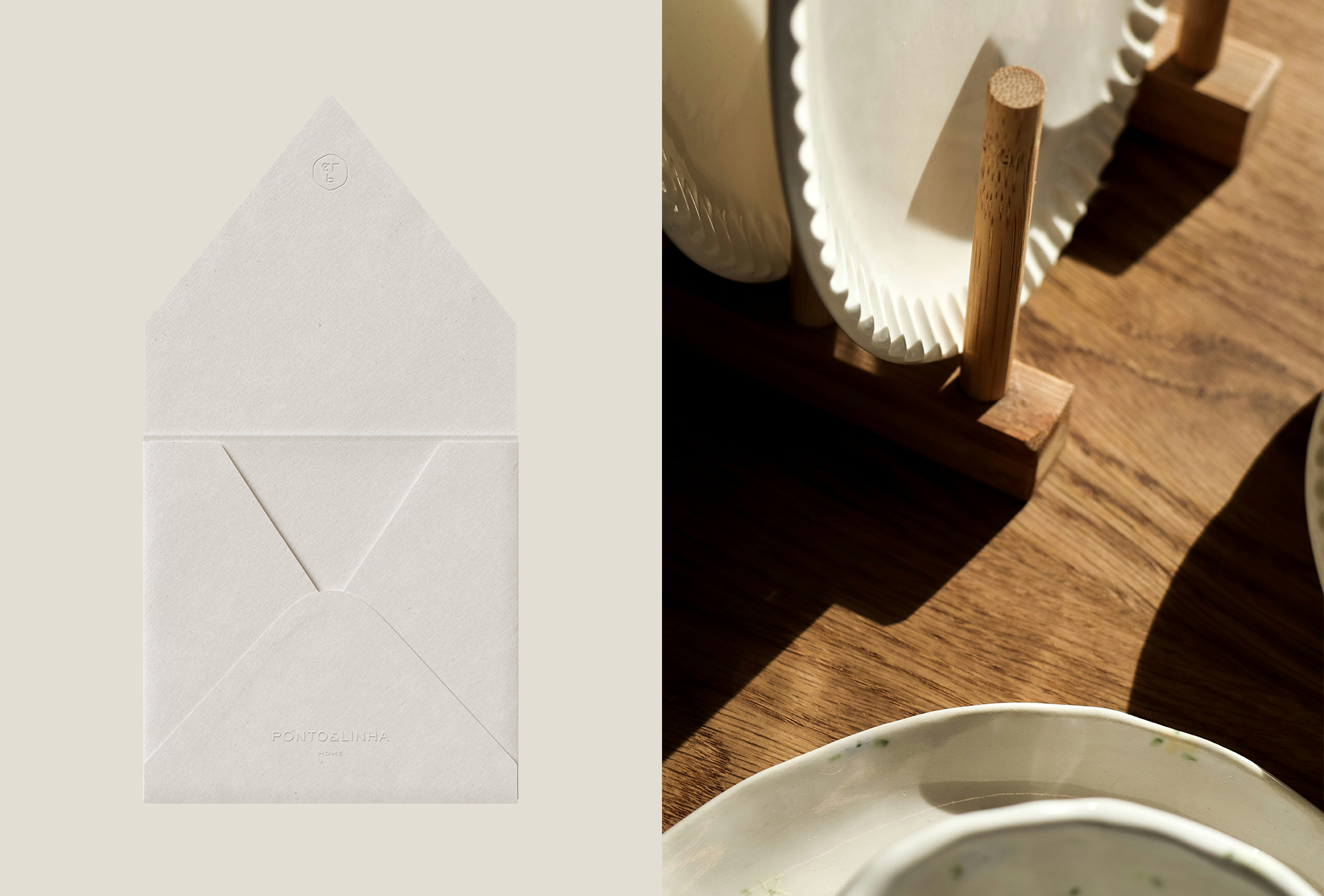
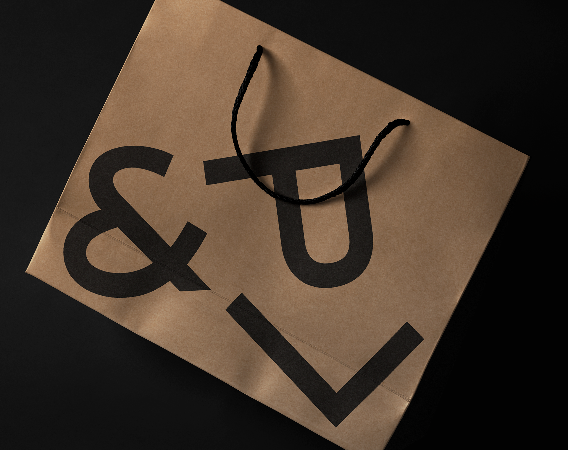
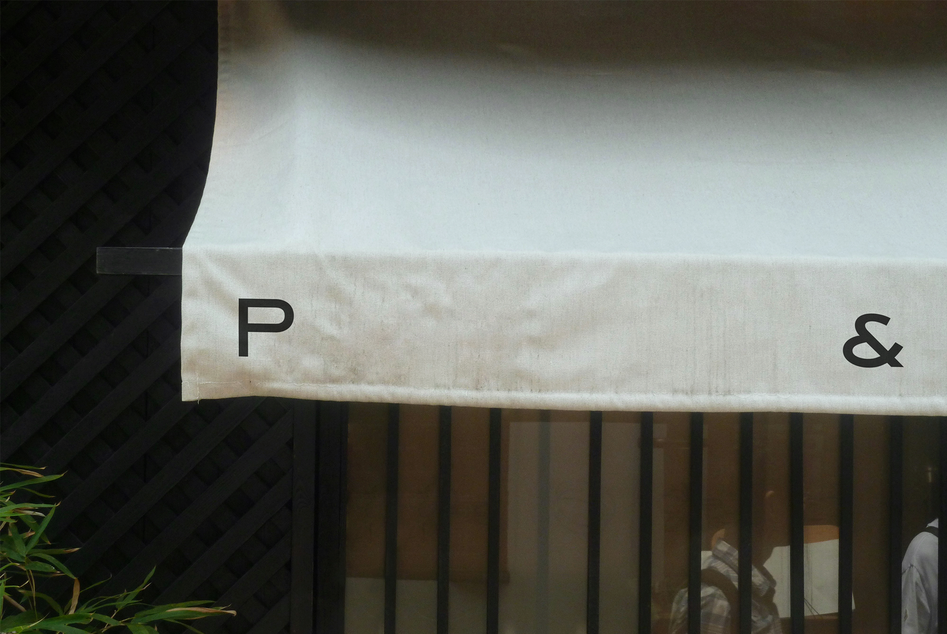
O antigo símbolo do novelo azul com o monograma PL em letras cursivas, transmitia uma mensagem equivocada e já não funcionava, pelo fato de manter a marca atrelada a um segmento o qual não mais a representava prioritariamente. A sua versão reduzida foi atualizada com sofisticação e sutileza, onde letras P & L são protagonistas em diferentes formatações, possibilitando maior versatilidade e fácil aplicabilidade em mídias físicas e digitais. Por fim, a escolha da tabela cromática (que transita entre bases neutras, relaxantes e suaves) e uma nova família tipográfica composta por três estilos distintos, dão o tom ideal, contemporâneo e harmonioso para constituir esta nova fase.
EN
The main purpose of this project was to build an identity that validated this new era, completely breaking with the amateurish and popular image the old brand carried, which left it stagnant due to its lack of communication aligned with its target audience.
This issue was resolved through a thorough study, where redefining all of its aesthetic attributes (starting with the redesign of its visual signature and support system) and analyzing how its competitors present themselves would be the starting point for this major change. A brand that delivers refinement, presence, and timelessness, with just the right amount of classic touch, relevant to those it intends to connect with from now on.
The old symbol of the blue ball of yarn with the PL monogram in cursive letters, conveyed the wrong message and no longer worked, as it kept the brand tied to a segment that no longer primarily represented it. Its reduced version has been updated with sophistication and subtlety, with P & L letters taking center stage in different formats, allowing for greater versatility and ease of use in both physical and digital media. Finally, the choice of color palette (which transitions between neutral, relaxing, and soft bases) and a new typeface family composed of three distinct styles set the ideal contemporary and harmonious tone for this new phase.

Design: Mateus Araújo
Projeto: Redesign de Identidade Visual
#studiomateusaraujo
www.studiomateusaraujo.com.br
Design by Studio Mateus Araújo
© All rights reserved.